
Adopting the New Window Controls in iPadOS 26

iPadOS has been evolving, and this year Apple is pushing the windowing experience even further in iPadOS 26 with the new Window Controls and a macOS-like menu bar.
Although Apple has released some videos demonstrating ways to adopt these changes, the related documentation provides no specific details, for example:
Therefore, this blog aims to explore how to adopt the new Window Controls in iPadOS 26 and will also cover some related APIs introduced this year.
Topics include:
For legacy apps that don’t build against iPadOS 26 SDK
For apps that use the standard controls
Change the behavior of Window Controls
Adopt your custom controls in SwiftUI
Adopt your custom controls in UIKit
Adopt your custom controls combing SwiftUI with UIKit
I’ve also created a sample app so you can experiment with these APIs. The code snippets shown below are included in the sample project. Running the project while reading is highly recommended, as it will help you better understand how everything works.
https://github.com/JuniperPhoton/CornerMarginSample
For legacy apps that don’t build against iPadOS 26 SDK
You may wonder for those legacy apps that don’t build against iPadOS 26 SDK, what would the behavior be like. In fact, Apple has done the adoption work for us: the new Window Controls will be inserted on top of the safe area, and will contribute to the top safe area.
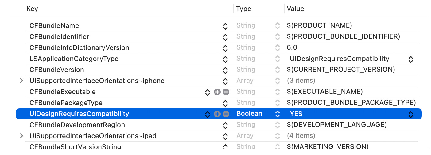
To test this behavior, set the UIDesignRequiresCompatibility to YES in the info.plist when creating a new project using Xcode 26, or you can just use Xcode 16 to create a new project.
When you resizing the Window on iPad, the value of the top safe area will remain the same, even when you put the app in the fullscreen mode.
That means that, if you have already respect the safe area when building your app, you don’t have to worry about anything. And this is the compatible mode in iPadOS 26, as not all apps would adopt the new API soon.
For apps that use the standard controls
If you have already use the standard controls, like the NavigationStack/NavigationSplitView + Toolbar in SwiftUI, or UINavigationController in UIKit, the system has already taken care for you, by placing the toolbar items at different position when you resize the window.
Given this code:
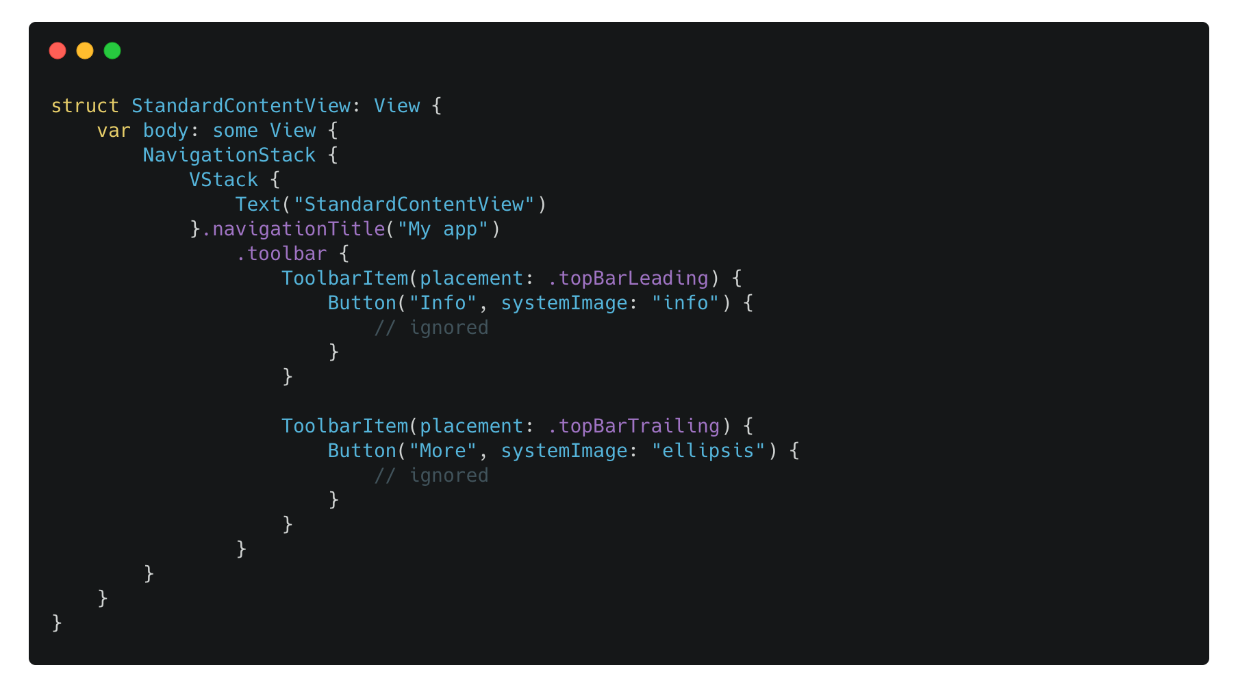
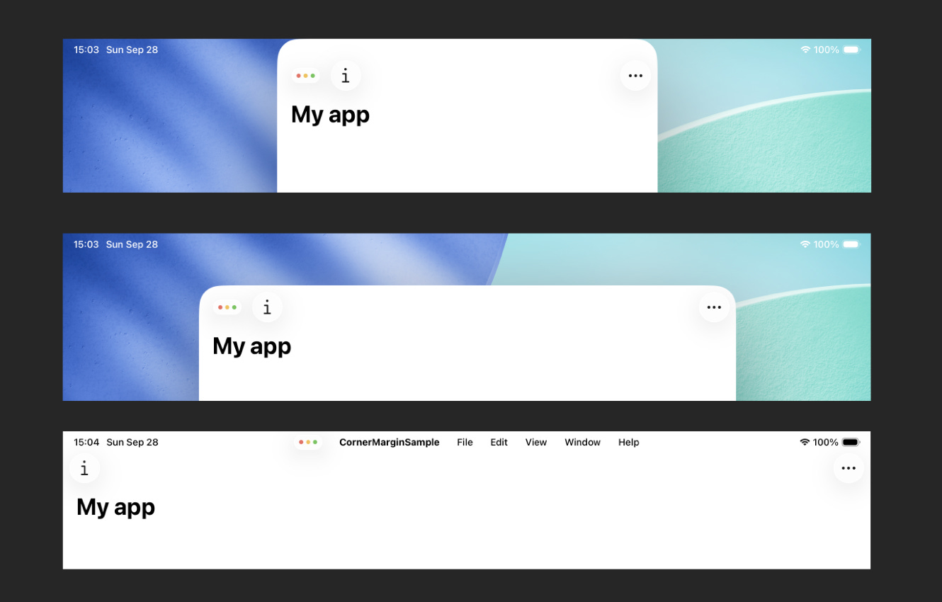
The image below shows how it looks when the window:
It’s placed on top of the screen, overlapping with the status bar.
It’s placed at the center of the screen.
It’s in fullscreen mode.
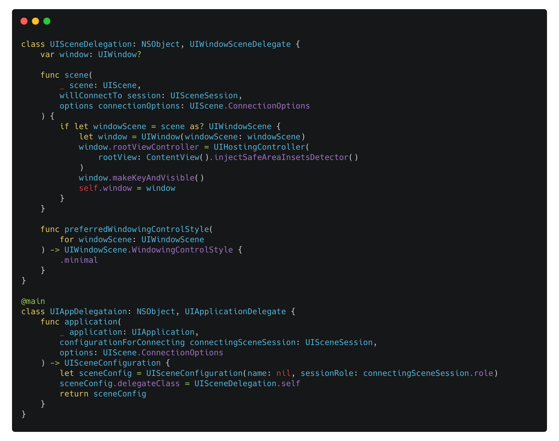
Change the behavior of Window Controls
To change the behavior of Window Controls, you have to implement the UIWindowSceneDelegate by yourself and override the preferredWindowingControlStyle(for:) method:
For UIWindowScene.WindowingControlStyle, there are 3 possible values:
automatic, which lets the system to decide.
minimal, which behaves like the legacy apps running in iPadOS 26, as mentioned earlier.
unified, the new behavior in iPadOS 26.
If you create your app using the SwiftUI template, it will take some steps to switch to the UIWindowSceneDelegate based lifecycle:
Implement your own
UIApplicationDelegate, and create aUISceneConfigurationinstance in theapplication(_:configurationForConnecting:options:)method, which also set the delegateClass class as your ownUIWindowSceneDelegateimplementation.
Implement your own
UIWindowSceneDelegate, create and manage the UIWindow.
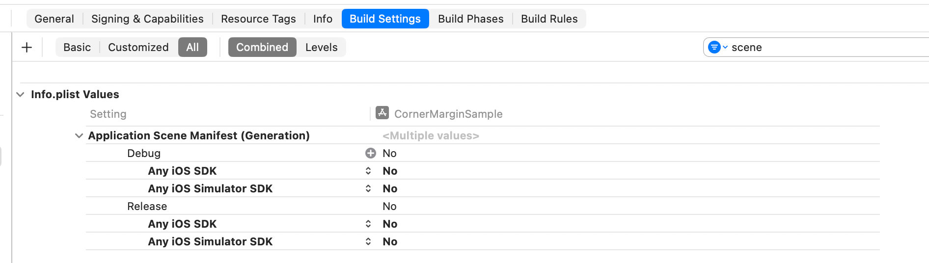
Tell the system not to generate the Application Scene Manifest.
In conclusion, even if you don’t set UIDesignRequiresCompatibility to YES and just use the new Liquid Glass design, you can still set the UIWindowScene.WindowingControlStyle to minimal to get the legacy behavior.
Adopt your custom controls in SwiftUI
Sometimes you may not use the standard controls mentioned before, as there are some design limitations provided by the system. For example, if you don’t like the default navigation title, you may need to build your own title bar. In this situation, you will need extra work to adopt your custom controls with the new Window Controls.
Consider the code below:
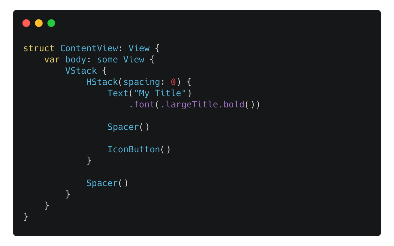
How it would look on iPadOS 26:
By default, SwiftUI will place your views within the safe area, so you don’t have to worry about dodging the status bar area, but in this case, you have to adjust the layout of your views with the consideration of the Window Controls.
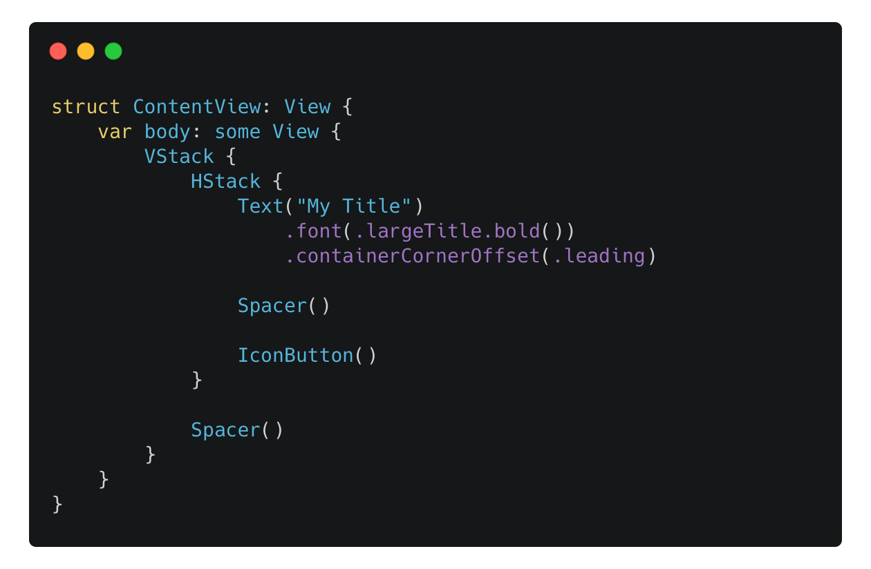
In SwiftUI, there’s a new API named containerCornerOffset(_:sizeToFit:) to help achieve that:
The code will result in:
However, it will just tweak the offset of the view, therefore, if the title has a following view that takes all the spare space, applying the containerCornerOffset(_:sizeToFit:) to the title view will result in two views being overlapped:
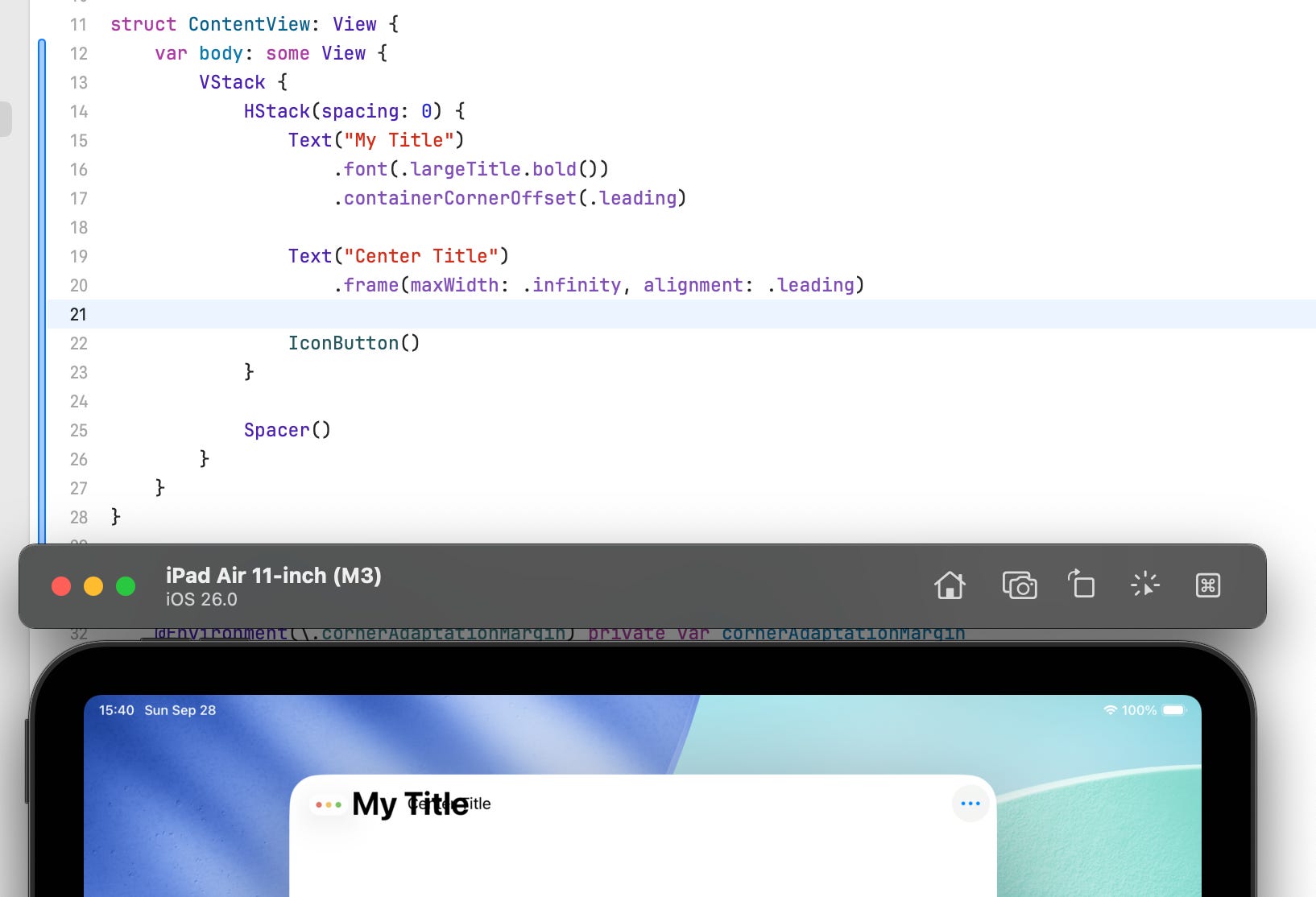
You may be thinking about applying the containerCornerOffset(_:sizeToFit:) to the whole outer HStack, but as I mentioned earlier, this API just adjust the offset of the view, applying this to the whole outer HStack will also offset the trailing “more” button, making it invisible.
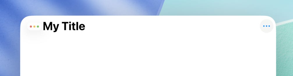
In this case, if we wish to make sure that both the title bar and the center title will adopt to the Window Controls:
Apply the
containerCornerOffset(_:sizeToFit:)to the outerHStackand set thesizeToFitto true. By settingsizeToFitto true, SwiftUI will also adjust the available space by subtracting the width of Window Controls.
Like this:
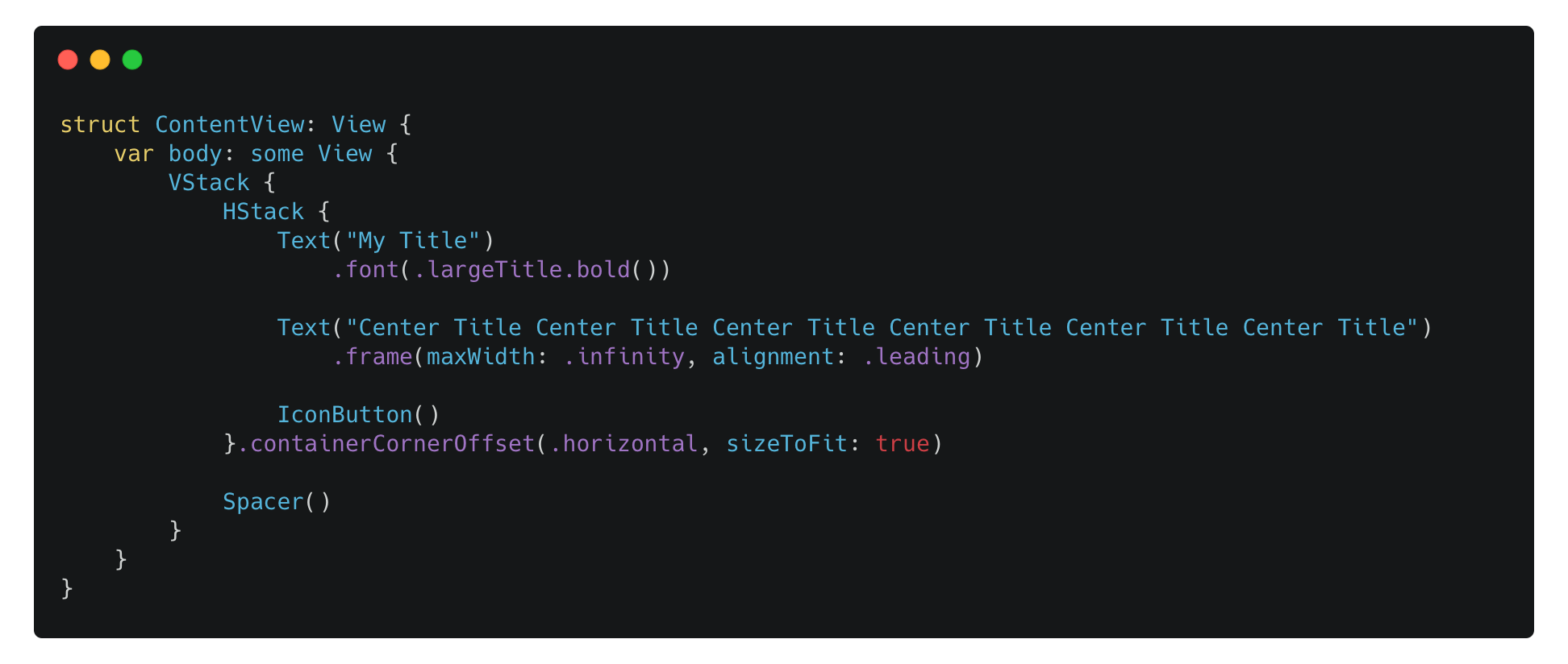
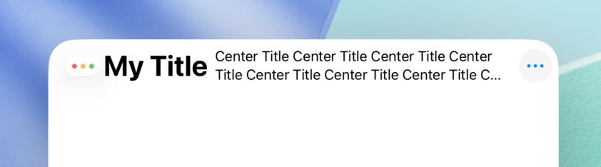
Now the main title, the center title and the trailing button won’t overlap with each other.
Adopt your custom controls in UIKit
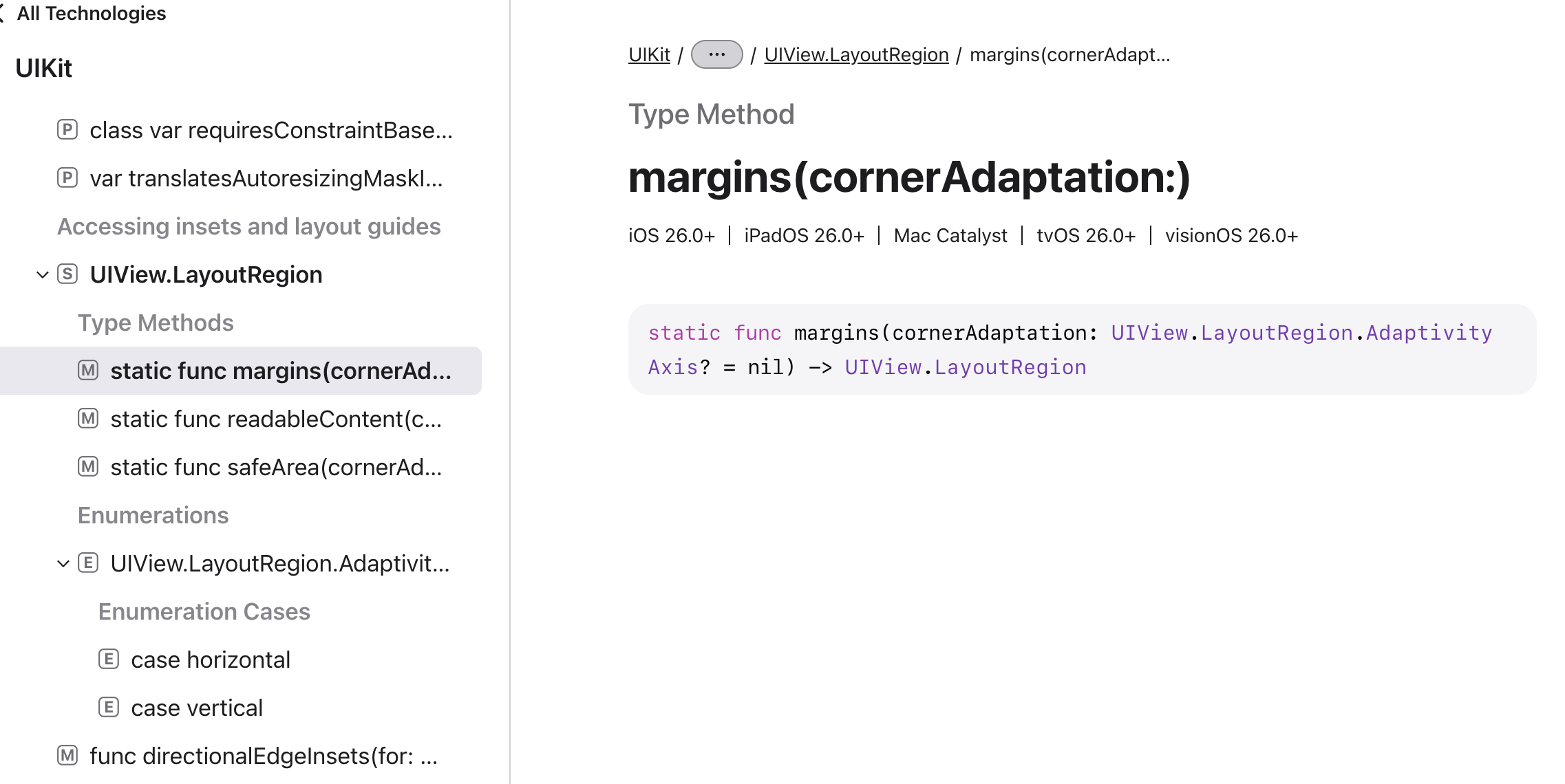
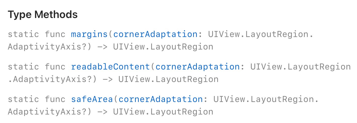
In UIKit, there’s a new definition named UIView.LayoutRegion of those regions including Safe Area as well as the Margin Layout:
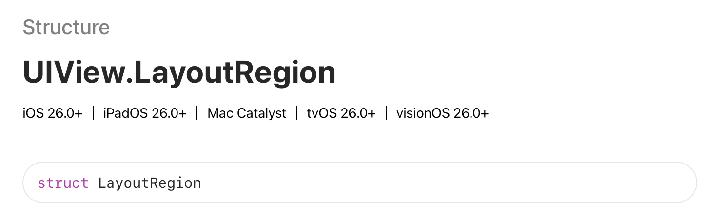
You can get the LayoutRegion by using its type methods. A LayoutRegion serves as a type and doesn’t provide any actual layout values. After you create a LayoutRegion you would like to know, use the new layoutGuide(for:) API from UIView to get the UILayoutGuide if you use Auto Layout, or use the edgeInsets(for:) or directionalEdgeInsets(for:) to get the edge insets, which will contain the actual point values if you layout your views by frames.
Example code to retrieve the UIEdgeInsets and the UILayoutGuide for both Safe Area and the new Corner Margins:
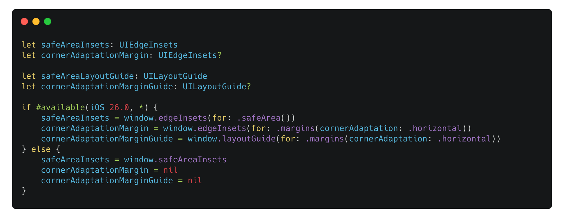
Once you have the inset values or the layout guide, you can use it to layout your view.
Adopt your custom controls combing SwiftUI with UIKit
In SwiftUI, we can’t get the inset values directly, but we can retrieve the inset values mentioned above in a UIView and the report it back to the SwiftUI world and inject the values as a pre-defined environment values.
The following code can be found in the sample app that I mentioned earlier.
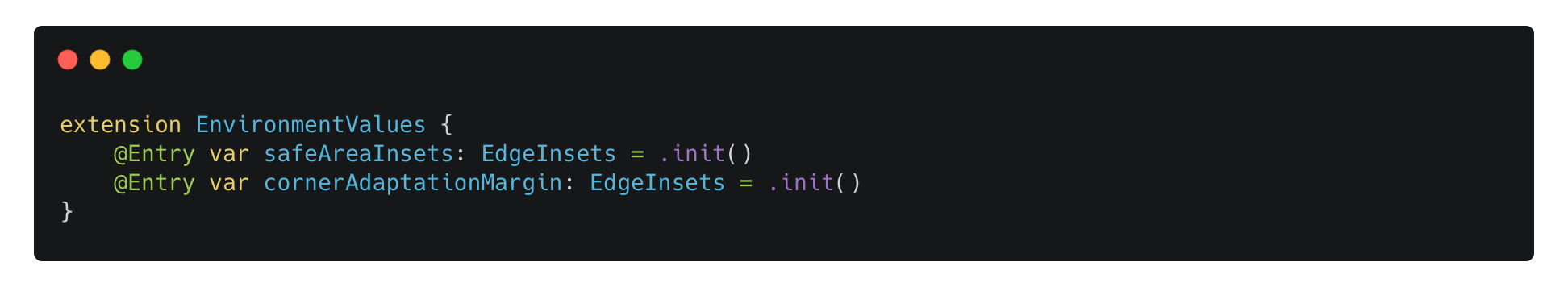
To do this, we first declare some custom environment values:
Then implement a ViewModifier to do the injection when the values change in the SafeAreaSizeDetector, which get the results from the underlying UIView.
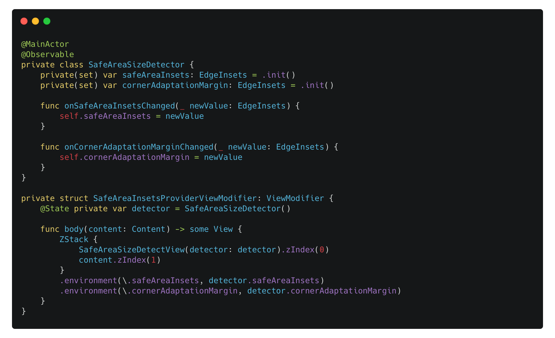
Here’s how the SafeAreaSizeDetectView will look like:
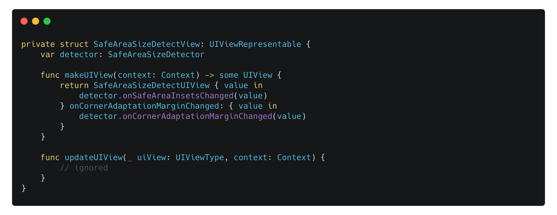
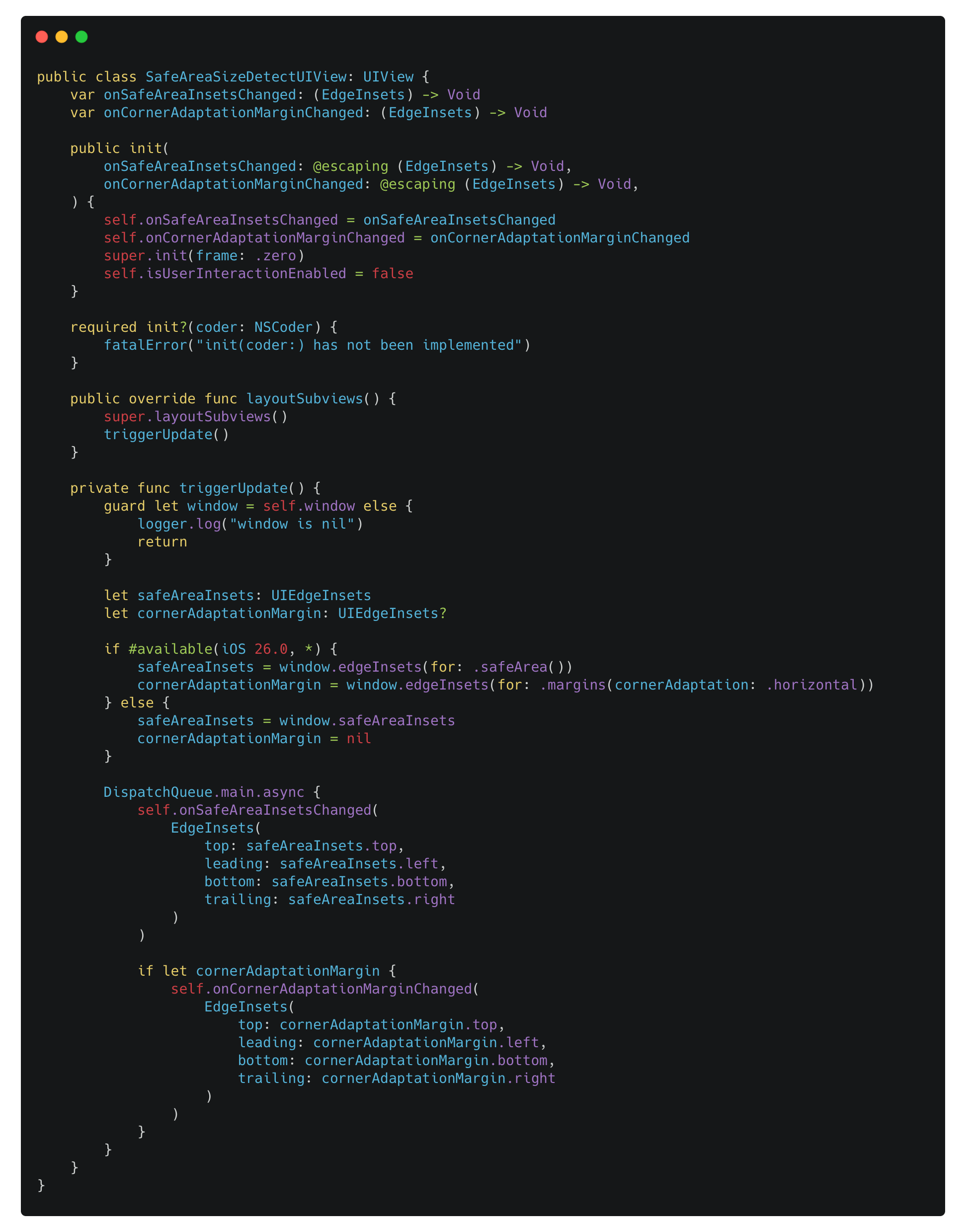
And finally, as for SafeAreaSizeDetectUIView, it retrieves the new value in the layoutSubviews method and report those value back.
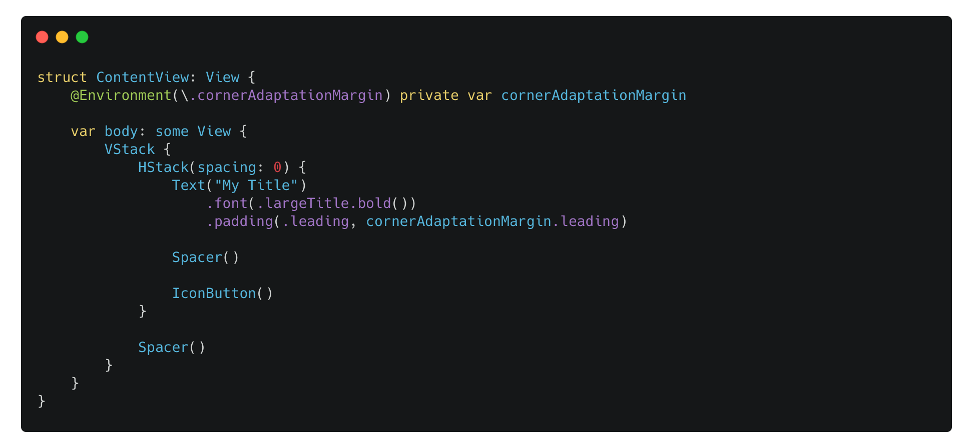
Then, in your SwiftUI view, you read the custom environment values and apply it to your view:
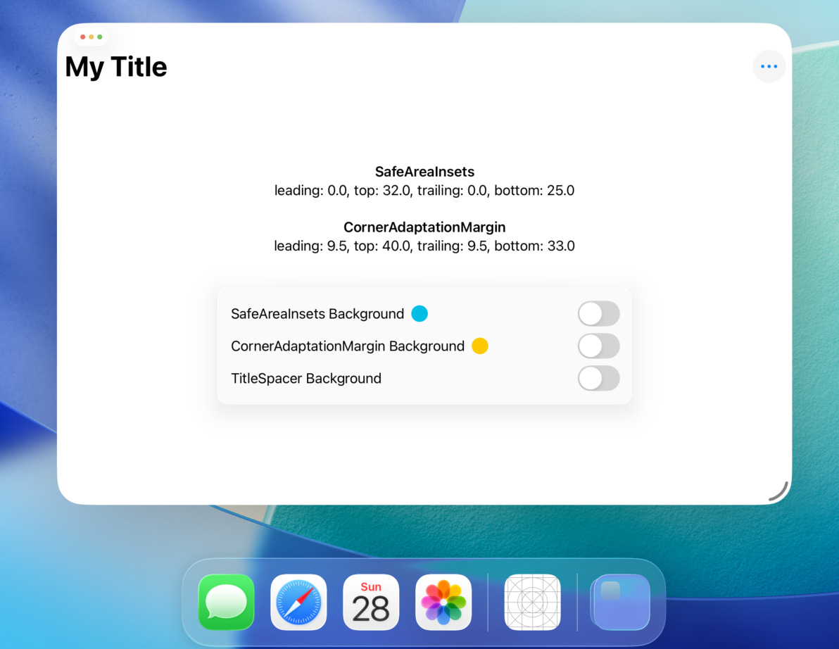
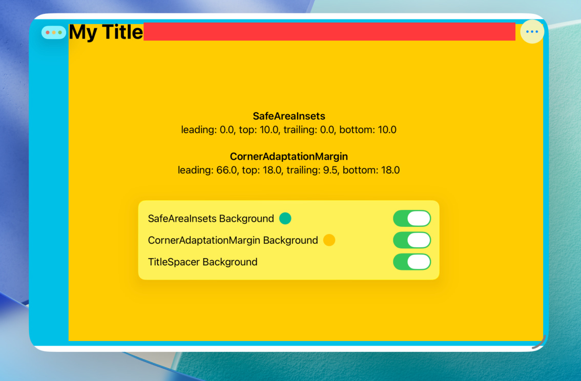
To help understand the Corner Adaptation Margin and the Safe Area visually, you can visualize those by applying the paddings to the background color. The sample app has already done this for you. Try run the sample app and then resize the window to see how the SafeAreaInsets and CornerAdaptationMargin change visually.
Conslusions
The introduction of Window Controls and Corner Adaptation Margins in iPadOS 26 represents a significant step toward a more desktop-like windowing experience on the iPad. While we may never see an iPad actually running macOS, Apple has been re-creating a similar experience within iPadOS in a more modern, touch-friendly way.
Users often say that iPad apps are “just iPad apps” and can’t replace macOS apps. But as developers, it’s our responsibility to refine iPad apps and bring greater productivity to the platform.